 I've had a little crush on typography ever since I heard the word: 'Typography'. I'm not sure exactly why but I just like the sound of the word...
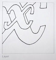
Today was a very interesting workshop - we learned to dissect an individual letter that we chose from a few selected classic typefaces, one that was thought-provoking...
I chose this 'x' and I marked the spot!
This is the start of my hunt for interesting type...
I saw this on the outside of (oh dear I cannot remember the name now... I will get back to this part) anyway, I always like fonts that have an extra swish and swash design added to it. Looking closely at it, it reminded me a bit of the typeface we used in our letterpress workshop (FRY'S ORNAMENTED) because of the influence of the 'crossbar' (if one could call it that?) I don't mind them, for example on the 'S' it's got one on the outside of it's belly/bowl which to me is a odd touch but that's what makes it a little different to some other Serif's however I've never really taken a huge liking to serifs but it goes with that era's style so I appreciate it! If you look at the 'L' you'll see a sort of beak/terminal coming off from the Spur, I think it's cute as if the creator was writing on a slant and the ink accidentally ran a little! If you look at the 'S' once again, it too has a bit of an 'ink-run' off the end of the bottom serif, this gives the letter a character.
The swish (what's it's real name?) from the 'N' is lovely - it makes me like the typeface more than if it did not have it...
Tuesday 23rd November - After a fantastic design agency hunt in Clerkenwell we walked past this eye-catching graffiti - what a contrast between the words and the colours this person or group have chosen, do you think they had no other colours but just wanted to get their message out there, or perhaps they were girls... but I think it's attractive and it softens what it's actually saying, you learn to like this in some respect.


No comments:
Post a Comment